Breadcrumb Navigation plays a vital role in modern web design by enhancing website usability and providing users with a clear navigation path. It allows visitors to easily trace their location within your website’s structure, improving both user experience and engagement.
In this tutorial, you’ll learn step-by-step how to create a stylish breadcrumb navigation bar using HTML and CSS — a simple yet visually appealing addition that gives your site a polished and professional feel.
Step 1: HTML Code
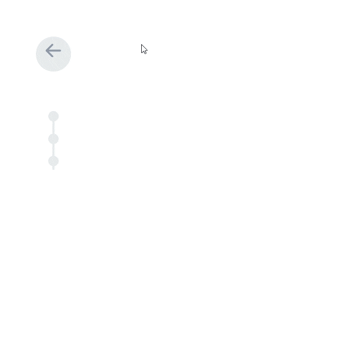
To begin, create a basic HTML file that will hold the structure of your breadcrumb navigation. This layout includes a back button, navigation path, and additional useful links.
HTML Structure Explanation
- DOCTYPE and HTML Setup
<!DOCTYPE html>
<html lang="en">
Declares the document type and specifies that the language of the content is English.
- Head Section
<head>
    <meta charset="UTF-8">
    <meta http-equiv="X-UA-Compatible" content="IE=edge">
    <meta name="viewport" content="width=device-width, initial-scale=1.0">
    <link rel="stylesheet" type="text/css" href="styles.css">
    <title>Breadcrumb Navigation</title>
</head>
- UTF-8 encoding ensures compatibility with most characters.
- Viewport settings make the layout responsive on all devices.
- The linked CSS file (styles.css) provides styling for the navigation.
- The title tag defines the browser tab text.
- Body Section and Back Button
<body>
    <div class="back">
        <a href="#" class="btn-back">
          <div>
            <svg width="16px" height="14px" viewBox="0 0 16 14">
              <path d="M1,7 L15,7"></path>
              <polyline points="7 1 1 7 7 13"></polyline>
            </svg>
          </div>
          <span>Back</span>
        </a>
This part includes a Back button with an SVG arrow icon to navigate to the previous page.
- Breadcrumb Navigation (Menu History)
        <div class="menu-back">
          <ul class="nav-history">
            <li><a href="#">Home</a></li>
            <li><a href="#">Components</a></li>
            <li class="active"><a href="#">Pure CSS Breadcrumb</a></li>
          </ul>
Here, the breadcrumb structure lists the navigation path where the current page is marked as active.
- Additional Links Section
          <ul class="nav-links">
            <li><a href="#">Blog</a></li>
            <li><a href="#">Terms and Conditions</a></li>
            <li><a href="#">Contact</a></li>
          </ul>
        </div>
      </div>
</body>
</html>
Includes additional secondary navigation links such as Blog, Terms, and Contact.
✅ Complete HTML Code
<!DOCTYPE html>
<html lang="en">
<head>
    <meta charset="UTF-8">
    <meta http-equiv="X-UA-Compatible" content="IE=edge">
    <meta name="viewport" content="width=device-width, initial-scale=1.0">
    <link rel="stylesheet" type="text/css" href="styles.css">
    <title>Breadcrumb Navigation</title>
</head>
<body>
    <div class="back">
        <a href="#" class="btn-back">
          <div>
            <svg width="16px" height="14px" viewBox="0 0 16 14">
              <path d="M1,7 L15,7"></path>
              <polyline points="7 1 1 7 7 13"></polyline>
            </svg>
          </div>
          <span>Back</span>
        </a>
        <div class="menu-back">
          <ul class="nav-history">
            <li><a href="#">Home</a></li>
            <li><a href="#">Components</a></li>
            <li class="active"><a href="#">Pure CSS Breadcrumb</a></li>
          </ul>
          <ul class="nav-links">
            <li><a href="#">Blog</a></li>
            <li><a href="#">Terms and Conditions</a></li>
            <li><a href="#">Contact</a></li>
          </ul>
        </div>
      </div>
</body>
</html>
Step 2: CSS Code
Next, we’ll add the styling that makes the breadcrumb navigation stand out. Create a styles.css file and paste the following CSS code.
✅ Complete CSS Code
body {
  font-family: 'Lato', sans-serif;
  font-size: 16px;
}
.back {
  position: fixed;
  top: 40px;
  left: 40px;
  width: 100px;
}
.back ul {
  display: block;
  margin-bottom: 0;
  list-style: none;
}
.back ul li {
  white-space: nowrap;
}
.back ul li a {
  text-decoration: none;
}
.back ul.nav-history {
  padding-left: 36px;
  padding-top: 25px;
  pointer-events: none;
}
.back ul.nav-history li {
  margin-bottom: 5px;
}
.back ul.nav-history li::after {
  content: '';
  position: absolute;
  left: 12px;
  width: 12px;
  height: 12px;
  border-radius: 50%;
  background: #e8eaed;
  transform: scale(0.9);
  transition: all 0.2s ease;
}
.back ul.nav-history li:not(:last-child)::before {
  content: '';
  position: absolute;
  left: 17px;
  margin-top: 10px;
  width: 2px;
  height: 28px;
  background: #e8eaed;
  transition: all 0.2s ease;
}
.back ul.nav-history li.active {
  pointer-events: none;
}
.back ul.nav-history li.active::after {
  background: #e8eaed;
}
.back ul.nav-history li.active a {
  color: #5a667f;
}
.back ul.nav-history li a {
  color: #418ad8;
  display: inline-block;
  opacity: 0;
  transform: translateY(-10px);
  transition: all 0.2s ease;
}
.back ul.nav-history li a:hover {
  color: #2b7cd2;
}
.back ul.nav-links {
  position: absolute;
  transform: translateY(-10px);
  margin-top: 20px;
  padding-left: 12px;
  opacity: 0;
  transition: all 0.2s ease;
  pointer-events: none;
}
.back ul.nav-links li:not(:last-child) {
  margin-bottom: 5px;
}
.back ul.nav-links li a {
  font-size: 14px;
  font-weight: 600;
  color: #c8ccd4;
  transition: color 0.2s ease;
}
.back ul.nav-links li a:hover {
  color: #9098a9;
}
.back:hover {
  width: auto;
}
.back:hover .menu-back {
  opacity: 1;
  transform: translateY(0);
}
.back:hover .btn-back div {
  background: rgba(65,138,216,0.25);
}
.back:hover .btn-back div svg path,
.back:hover .btn-back div svg polyline {
  stroke: #418ad8;
}
.back:hover .btn-back span {
  transform: translateX(0);
  opacity: 1;
}
.back:hover ul.nav-history {
  transform: translateY(0);
  pointer-events: auto;
}
.back:hover ul.nav-history li {
  margin-bottom: 8px;
}
.back:hover ul.nav-history li::after {
  background: #418ad8;
  transform: translateY(6px);
}
.back:hover ul.nav-history li.active::after {
  background: #5a667f;
}
.back:hover ul.nav-history li a {
  opacity: 1;
  transform: translateY(0);
}
.back:hover ul.nav-links {
  position: relative;
  opacity: 1;
  transform: translateY(0);
  pointer-events: auto;
}
.btn-back {
  display: inline-block;
}
.btn-back div {
  position: relative;
  z-index: 1;
  width: 36px;
  height: 36px;
  border-radius: 50%;
  background: #e8eaed;
  float: left;
}
.btn-back div svg {
  fill: none;
  transform: translate(10px, 7px);
}
.btn-back div svg path,
.btn-back div svg polyline {
  stroke: #9098a9;
  stroke-width: 2;
  stroke-linejoin: round;
  stroke-linecap: round;
}
.btn-back span {
  display: inline-block;
  color: #418ad8;
  margin-left: 10px;
  line-height: 34px;
  opacity: 0;
  transform: translateX(-20px);
  transition: all 0.2s ease;
}
.btn-back:hover span {
  color: #2b7cd2;
}
Preview
Once implemented, the breadcrumb navigation will smoothly expand on hover, displaying both the breadcrumb trail and additional menu links — making your navigation interactive and visually pleasing.
Conclusion
Building a clean, responsive breadcrumb navigation using HTML and CSS enhances user experience and gives your website a professional structure. You can customize colors, fonts, and animations to match your brand identity. This simple yet elegant navigation design helps users easily find their way through your site — a must-have element for modern web design.