In this tutorial, you’ll learn how to build a pure CSS sound bars animation—no JavaScript, no libraries, and no frameworks required. Even beginners with basic HTML and CSS knowledge will easily follow along.
Creating interactive visual effects using just HTML and CSS is one of the best ways to improve your front-end development skills. Among the most popular UI animations is the sound bars animation, often seen in music players, voice recorders, or audio visualizers.
Project Introduction
Sound bars are commonly used to represent audio levels or simulate sound waves visually. While many developers use JavaScript or external animation libraries to create these effects, CSS alone is powerful enough to achieve fluid, realistic motion.
In this guide, we’ll create a minimal yet visually appealing sound bar effect using only ten div elements and some carefully crafted CSS animations.
This is a perfect project if you:
- want to learn CSS keyframe animations,
- want to build a small UI component for your website,
- want a creative beginner-friendly practice project.
Prerequisites
Before you begin, you should already be familiar with:
- Basic HTML structure
- CSS properties and selectors
- Using a code editor such as VS Code, Sublime Text, or Notepad++
Once ready, create two files:
- index.html
- styles.css
Now let’s start building!
Step 1: Writing the HTML Structure
Our sound bars consist of a container (#bars) and ten vertical bars (.bar). Each bar will grow and shrink using CSS animations.
Below is the exact HTML code to use.
👉 Do NOT modify anything; this must stay the same.
<!DOCTYPE html>
<html lang="en">
<head>
    <meta charset="UTF-8">
    <meta http-equiv="X-UA-Compatible" content="IE=edge">
    <meta name="viewport" content="width=device-width, initial-scale=1.0">

    <title>Sound Bars Animation</title>

     <link rel="stylesheet" type="text/css" href="styles.css">
</head>
<body>
<h1>CSS Sound Bars</h1>
<div id="bars">
    <div class="bar"></div>
    <div class="bar"></div>
    <div class="bar"></div>
    <div class="bar"></div>
    <div class="bar"></div>
    <div class="bar"></div>
    <div class="bar"></div>
    <div class="bar"></div>
    <div class="bar"></div>
    <div class="bar"></div>
</div>
</body>
</html>
This simple layout gives us the base structure required for our animated bars.
Step 2: Adding the CSS Styling and Animation
Next, open your styles.css file and paste the following stylesheet exactly as provided. It includes:
- Page background styling
- Bar positioning
- Key frame animations
- Unique animation duration for each bar
👉 Again, code must remain unchanged.
body{
  background-color: #d6cbcb;
}

h1 {
  color: #555;
  font: bold 32px Roboto;
  left: 0;
  margin: 20px 0 0 0;
  position: absolute;
  top: 50%;
  text-align: center;
  width: 100%;
}

#bars {
  height: 30px;
  left: 50%;
  margin: -30px 0 0 -20px;
  position: absolute;
  top: 50%;
  width: 50px;
}

.bar {
 background: #333;
  bottom: 1px;
  height: 6px;
  position: absolute;
  width: 3px;
  animation: sound 0ms -800ms linear infinite alternate;
}

@keyframes sound {
  0% {
     opacity: .35;
      height: 5px;
  }
  100% {
      opacity: 1;
      height: 50px;
  }
}

.bar:nth-child(1)  { left: 1px; animation-duration: 474ms; }
.bar:nth-child(2)  { left: 5px; animation-duration: 433ms; }
.bar:nth-child(3)  { left: 9px; animation-duration: 407ms; }
.bar:nth-child(4)  { left: 13px; animation-duration: 458ms; }
.bar:nth-child(5)  { left: 17px; animation-duration: 400ms; }
.bar:nth-child(6)  { left: 21px; animation-duration: 427ms; }
.bar:nth-child(7)  { left: 25px; animation-duration: 441ms; }
.bar:nth-child(8)  { left: 29px; animation-duration: 419ms; }
.bar:nth-child(9)  { left: 33px; animation-duration: 487ms; }
.bar:nth-child(10) { left: 37px; animation-duration: 442ms; }
How This CSS Works
1. Basic Styling
The background color and centered heading help frame the animation visually.
2. Positioning the Bars
The #bars container is precisely positioned in the center of the screen using absolute position and negative margins.
3. Bar Appearance
Each .bar starts with:
height: 6px- a light background color
- an absolute bottom position
4. Animation with Keyframes
The @keyframes sound animation gradually increases:
- height from 5px → 50px
- opacity from 0.35 → 1
This creates the classic “rising bar” movement.
5. Variation Through nth-child()
Each bar is given:
- its own
leftposition - its own animation duration
These subtle differences give the waves a natural, UN-synchronized look—making the animation visually appealing.
Final Output
Once everything is saved, open your HTML file in any modern browser. You should see animated bars smoothly rising and falling, mimicking sound waves.
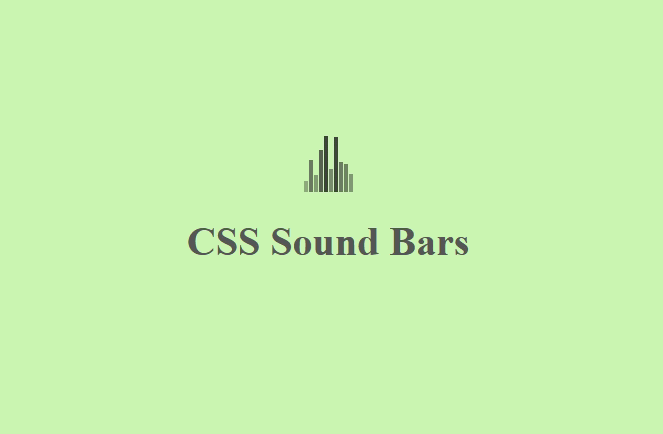
This effect is lightweight, clean, and requires zero JavaScript—perfect for UI components, loading screens, audio indicators, or creative website elements.
Conclusion
In this tutorial, you learned how to build a realistic sound bars animation using pure HTML and CSS. By leveraging CSS key frames and nth-child selectors, you can create dynamic, fluid animations without external tools or scripts.
This project is excellent for beginners wanting to practice CSS animations and for developers who want to add compact, visually appealing UI elements to their web pages.