Creating a responsive blog card grid layout is an excellent way to display posts cleanly and professionally on any blog or website. In this tutorial, you’ll learn how to build a stylish blog card layout using only HTML and CSS. By the end, you’ll understand how the structure works, how to style the cards, and how to make the entire layout responsive across different screen sizes.
[ez-toc]
📌 Project Overview
A blog card is a compact component used to highlight key details of a post—such as the title, description, date, and category. A well-designed card enhances user experience by offering clarity, simplicity, and an attractive visual layout.
In this guide, we will create a fully responsive blog card grid layout using pure HTML and CSS. Let’s get started!
🧩 Prerequisites
Before beginning, make sure you have:
- Basic knowledge of HTML and CSS
- A code editor like VS Code, Sublime Text, or similar.
🛠 Step 1: HTML Code
We’ll begin by setting up the base structure of our blog cards. The HTML below contains three cards inside a section. Each card includes a background image, title, description, date, and tag.
Do NOT modify the code — use it exactly as it is:
<!DOCTYPE html>
<html lang="en">
  <head>
    <title>Responsive Blog Card</title>
    <meta charset="UTF-8" />
    <meta name="viewport" content="width=device-width" />
    <link rel="stylesheet" href="styles.css" />
  </head>
  <body>
<section class="cards-wrapper">
  <div class="card-grid-space">
    <div class="num">01</div>
    <a class="card" href="https://www.myritebook.com/css/squid-game-css-loaders-using-pure-html-css/" style="--bg-img: url(https://www.myritebook.com/wp-content/uploads/2025/11/Squid-Game-CSS-Loaders-Using-Pure-HTML-CSS.png)">
      <div>
        <h1>Squid Game Loaders</h1>
        <p>Loaders are one of the classic components used to create an attractive website…</p>
        <div class="date">21 November 2025</div>
        <div class="tags">
          <div class="tag">CSS</div>
        </div>
      </div>
    </a>
  </div>
  <div class="card-grid-space">
    <div class="num">02</div>
    <a class="card" href="https://www.myritebook.com/css/create-glowing-pulse-search-bar-using-html-and-pure-css/" style="--bg-img: url('https://www.myritebook.com/wp-content/uploads/2024/06/Create-Glowing-Pulse-Search-Bar-Using-HTML-and-Pure-CSS1.png')">
      <div>
        <h1>Glowing Pulse Search Bar</h1>
        <p>When it comes to website elements that are beautiful and must-haves…</p>
        <div class="date">24 April 2024</div>
        <div class="tags">
          <div class="tag">CSS</div>
        </div>
      </div>
    </a>
  </div>
  <div class="card-grid-space">
    <div class="num">03</div>
    <a class="card" href="https://www.myritebook.com/css/build-a-digital-clock-using-html-css-and-javascript/" style="--bg-img: url('https://www.myritebook.com/wp-content/uploads/2024/06/Create-Glowing-Pulse-Search-Bar-Using-HTML-and-Pure-CSS1.png')">
      <div>
        <h1>Digital Clock</h1>
        <p>A digital clock means it shows time in number format…</p>
        <div class="date">12 July 2022</div>
        <div class="tags">
          <div class="tag">CSS</div>
        </div>
      </div>
    </a>
  </div>
</section>
  </body>
</html>
This completes the structural layout. Next, let’s design it using CSS.
🎨 Step 2: CSS Code
Now that the HTML is ready, we’ll style the cards using CSS. The styling includes layout configuration, fonts, animations, and responsive behavior. Media queries ensure that the layout adjusts seamlessly across all screen sizes—from desktops to mobile devices.
Use the CSS exactly as provided:
@import url('https://fonts.googleapis.com/css?family=Heebo:400,700|Open+Sans:400,700');

:root {
  --color: #3c3163;
  --transition-time: 0.5s;
}

* {
  box-sizing: border-box;
}

body {
  margin: 0;
  min-height: 100vh;
  font-family: 'Open Sans';
  background: #fafafa;
}

a {
  color: inherit;
}

.cards-wrapper {
  display: grid;
  justify-content: center;
  align-items: center;
  grid-template-columns: 1fr 1fr 1fr;
  grid-gap: 4rem;
  padding: 4rem;
  margin: 0 auto;
  width: max-content;
}

.card {
  font-family: 'Heebo';
  --bg-filter-opacity: 0.5;
  background-image: linear-gradient(rgba(0,0,0,var(--bg-filter-opacity)),rgba(0,0,0,var(--bg-filter-opacity))), var(--bg-img);
  height: 20em;
  width: 15em;
  font-size: 1.5em;
  color: white;
  border-radius: 1em;
  padding: 1em;
  /*margin: 2em;*/
  display: flex;
  align-items: flex-end;
  background-size: cover;
  background-position: center;
  box-shadow: 0 0 5em -1em black;
  transition: all, var(--transition-time);
  position: relative;
  overflow: hidden;
  border: 10px solid #ccc;
  text-decoration: none;
}

.card:hover {
  transform: rotate(0);
}

.card h1 {
  margin: 0;
  font-size: 1.5em;
  line-height: 1.2em;
}

.card p {
  font-size: 0.75em;
  font-family: 'Open Sans';
  margin-top: 0.5em;
  line-height: 2em;
}

.card .tags {
  display: flex;
}

.card .tags .tag {
  font-size: 0.75em;
  background: rgba(255,255,255,0.5);
  border-radius: 0.3rem;
  padding: 0 0.5em;
  margin-right: 0.5em;
  line-height: 1.5em;
  transition: all, var(--transition-time);
}

.card:hover .tags .tag {
  background: var(--color);
  color: white;
}

.card .date {
  position: absolute;
  top: 0;
  right: 0;
  font-size: 0.75em;
  padding: 1em;
  line-height: 1em;
  opacity: .8;
}

.card:before, .card:after {
  content: '';
  transform: scale(0);
  transform-origin: top left;
  border-radius: 50%;
  position: absolute;
  left: -50%;
  top: -50%;
  z-index: -5;
  transition: all, var(--transition-time);
  transition-timing-function: ease-in-out;
}

.card:before {
  background: #ddd;
  width: 250%;
  height: 250%;
}

.card:after {
  background: white;
  width: 200%;
  height: 200%;
}

.card:hover {
  color: var(--color);
}

.card:hover:before, .card:hover:after {
  transform: scale(1);
}

.card-grid-space .num {
  font-size: 3em;
  margin-bottom: 1.2rem;
  margin-left: 1rem;
}

.info {
  font-size: 1.2em;
  display: flex;
  padding: 1em 3em;
  height: 3em;
}

.info img {
  height: 3em;
  margin-right: 0.5em;
}

.info h1 {
  font-size: 1em;
  font-weight: normal;
}

/* MEDIA QUERIES */
@media screen and (max-width: 1285px) {
  .cards-wrapper {
    grid-template-columns: 1fr 1fr;
  }
}

@media screen and (max-width: 900px) {
  .cards-wrapper {
    grid-template-columns: 1fr;
  }
  .info {
    justify-content: center;
  }
  .card-grid-space .num {
    margin-left: 0;
    text-align: center;
  }
}

@media screen and (max-width: 500px) {
  .cards-wrapper {
    padding: 4rem 2rem;
  }
  .card {
    max-width: calc(100vw - 4rem);
  }
}

@media screen and (max-width: 450px) {
  .info {
    display: block;
    text-align: center;
  }
  .info h1 {
    margin: 0;
  }
}
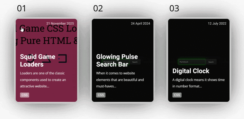
Final Output
🎯 Conclusion
In this tutorial, you learned how to build a responsive blog card grid layout using HTML and CSS. We covered:
- Creating the HTML structure
- Styling with CSS for a modern, clean design
- Adding hover effects and animations
- Making the layout responsive using media queries
- Using CSS Grid to organize multiple cards effortlessly
With this knowledge, you can now create stunning blog cards for personal websites, portfolios, or full blog layouts.
Download Full Project Source Code
Get complete project source code files, reusable resources and implementation examples.
Preparing Secure Download 10