In this tutorial, we’ll walk you through creating a pure CSS animated search box using only HTML and CSS — no JavaScript or external libraries required. When building a website, even small design elements — like a search bar — can make a huge difference in user experience. The search bar is one of the most essential parts of a website. It allows users to type queries and quickly find the content they’re looking for.
📘 Project Overview
Pure CSS means creating beautiful designs and animations using only CSS properties — no scripts or frameworks. This guide will help you design a visually appealing, interactive, and responsive animated search box that expands smoothly when clicked.
⚙️ Prerequisites
Before starting, make sure you have:
- A basic understanding of HTML and CSS
- A text editor such as Visual Studio Code, Sublime Text, or Notepad++
🧱 Step 1: HTML Code
Let’s start by creating the structure of our search box using HTML. We’ll use semantic HTML elements for better accessibility and SEO.
Create a file named index.html and add the following code:
<!DOCTYPE html>
<html lang="en">
<head>
    <meta charset="UTF-8">
    <meta http-equiv="X-UA-Compatible" content="IE=edge">
    <meta name="viewport" content="width=device-width, initial-scale=1.0">
    <link rel="stylesheet" type="text/css" href="styles.css">
    <title>Document</title>
</head>
<body>
    <form action="" class="search-bar">
        <input type="search" name="search" pattern=".*\S.*" required>
        <button class="search-btn" type="submit">
            <span>Search</span>
        </button>
    </form>
</body>
</html>
This markup creates a simple search form with an input field and a submit button. Next, we’ll make it come alive with CSS animations.
🎨 Step 2: CSS Code
Now, we’ll style and animate our search box using pure CSS. Create a file named styles.css and paste the following code inside:
* {
	border: 0;
	box-sizing: border-box;
	margin: 0;
	padding: 0;
}
:root {
	font-size: calc(16px + (24 - 16)*(100vw - 320px)/(1920 - 320));
}
body, button, input {
	font: 1em Hind, sans-serif;
	line-height: 1.5em;
}
body, input {
	color: #171717;
}
body, .search-bar {
	display: flex;
}
body {
	background: #96ffd1;
	height: 100vh;
}
.search-bar input,
.search-btn,
.search-btn:before,
.search-btn:after {
	transition: all 0.25s ease-out;
}
.search-bar input,
.search-btn {
	width: 3em;
	height: 3em;
}
.search-bar input:invalid:not(:focus),
.search-btn {
	cursor: pointer;
}
.search-bar,
.search-bar input:focus,
.search-bar input:valid  {
	width: 100%;
}
.search-bar input:focus,
.search-bar input:not(:focus) + .search-btn:focus {
	outline: transparent;
}
.search-bar {
	margin: auto;
	padding: 1.5em;
	justify-content: center;
	max-width: 30em;
}
.search-bar input {
	background: transparent;
	border-radius: 1.5em;
	box-shadow: 0 0 0 0.4em #171717 inset;
	padding: 0.75em;
	transform: translate(0.5em,0.5em) scale(0.5);
	transform-origin: 100% 0;
	-webkit-appearance: none;
	-moz-appearance: none;
	appearance: none;
}
.search-bar input::-webkit-search-decoration {
	-webkit-appearance: none;
}
.search-bar input:focus,
.search-bar input:valid {
	background: #fff;
	border-radius: 0.375em 0 0 0.375em;
	box-shadow: 0 0 0 0.1em #d9d9d9 inset;
	transform: scale(1);
}
.search-btn {
	background: #171717;
	border-radius: 0 0.75em 0.75em 0 / 0 1.5em 1.5em 0;
	padding: 0.75em;
	position: relative;
	transform: translate(0.25em,0.25em) rotate(45deg) scale(0.25,0.125);
	transform-origin: 0 50%;
}
.search-btn:before,
.search-btn:after {
	content: "";
	display: block;
	opacity: 0;
	position: absolute;
}
.search-btn:before {
	border-radius: 50%;
	box-shadow: 0 0 0 0.2em #f1f1f1 inset;
	top: 0.75em;
	left: 0.75em;
	width: 1.2em;
	height: 1.2em;
}
.search-btn:after {
	background: #f1f1f1;
	border-radius: 0 0.25em 0.25em 0;
	top: 51%;
	left: 51%;
	width: 0.75em;
	height: 0.25em;
	transform: translate(0.2em,0) rotate(45deg);
	transform-origin: 0 50%;
}
.search-btn span {
	display: inline-block;
	overflow: hidden;
	width: 1px;
	height: 1px;
}

.search-bar input:focus + .search-btn,
.search-bar input:valid + .search-btn {
	background: #2762f3;
	border-radius: 0 0.375em 0.375em 0;
	transform: scale(1);
}
.search-bar input:focus + .search-btn:before,
.search-bar input:focus + .search-btn:after,
.search-bar input:valid + .search-btn:before,
.search-bar input:valid + .search-btn:after {
	opacity: 1;
}
.search-bar input:focus + .search-btn:hover,
.search-bar input:valid + .search-btn:hover,
.search-bar input:valid:not(:focus) + .search-btn:focus {
	background: #0c48db;
}
.search-bar input:focus + .search-btn:active,
.search-bar input:valid + .search-btn:active {
	transform: translateY(1px);
}

@media screen and (prefers-color-scheme: dark) {
	body, input {
		color: #f1f1f1;
	}
	body {
		background: #171717;
	}
	.search-bar input {
		box-shadow: 0 0 0 0.4em #f1f1f1 inset;
	}
	.search-bar input:focus,
	.search-bar input:valid {
		background: #3d3d3d;
		box-shadow: 0 0 0 0.1em #3d3d3d inset;
	}
	.search-btn {
		background: #f1f1f1;
	}
}
🧠 Explanation
This CSS code adds transitions, smooth animations, and a clean layout. When users click the input field, the search bar expands beautifully and changes color to indicate focus. It even supports dark mode, automatically adjusting colors based on user preferences.
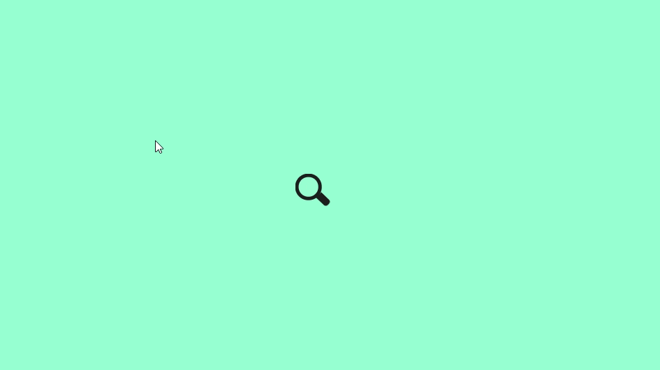
🎥 Preview
Once everything is set up, open your HTML file in a browser. You’ll see a compact search icon that expands smoothly into a full-width animated search bar.
🏁 Conclusion
You’ve successfully created a pure CSS animated search box using only HTML and CSS — no JavaScript at all. This simple yet elegant component enhances both the functionality and design of your website.
Experiment with colors, shapes, and animations to make it fit your project’s theme perfectly.