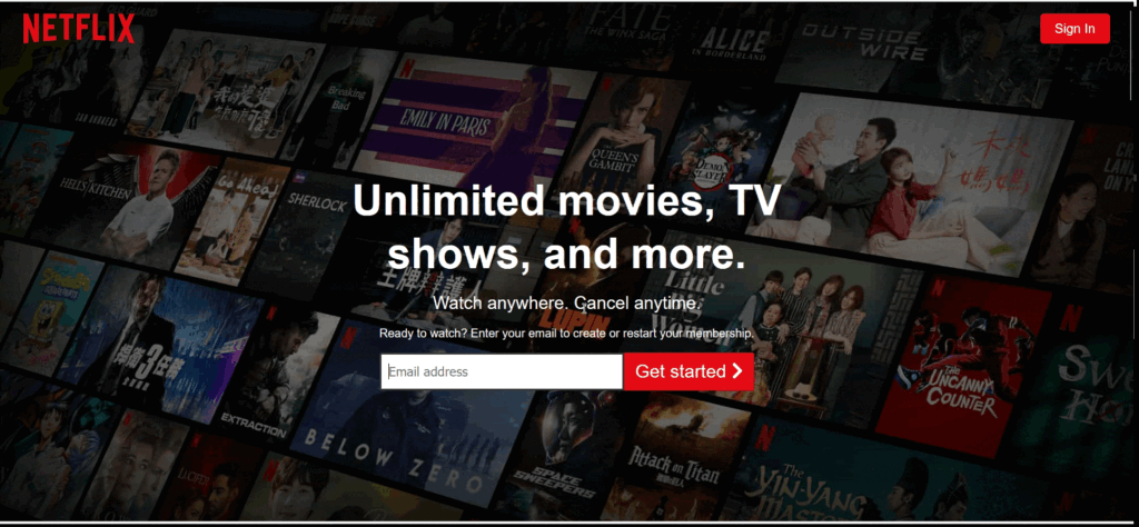
Looking to create a stunning Netflix-style landing page for your next project? You’re in the right place! This guide walks you through the entire process of building a beautiful Netflix landing page clone using HTML, CSS, and JavaScript—even if you’re a beginner. With clean source code and easy-to-follow steps, you’ll have a professional-looking page in just a couple of minutes.
This tutorial shows you how to replicate the classic Netflix hero section, interactive FAQ accordion, responsive layouts, and more—all from scratch.
Project Overview
A Netflix landing page clone is a web layout crafted to resemble the real Netflix homepage. Developers often build this kind of clone to practice their front-end skills, enhance their portfolio, or understand how professional streaming layouts are structured. This tutorial focuses on simplicity while still giving you a polished, responsive design.
By the end, you’ll know how to:
✔ Create a Netflix-style hero banner
✔ Add email subscription form UI
✔ Structure content sections
✔ Animate video overlays
✔ Build a dropdown language selector
✔ Add expandable FAQ sections
✔ Make the layout responsive
Let’s dive in!
Prerequisites
Before getting started, you should have:
- Basic HTML, CSS, and JavaScript knowledge
- A code editor like VS Code, Sublime Text
Step 1 — HTML Code (Copy & Paste Into Your .html File)
Step 2 (CSS Code):
This CSS file adds the signature Netflix look—dark theme, responsive layout, animations, and stylish sections.
/* global setting */
* {
    box-sizing: border-box;
    margin: 0;
    padding: 0;
}
body {
    background: #000;
    color: #fff;
    font-weight: 500;
    font-family: Arial, sans-serif;
}
ul {
    list-style: none;
}
.lg {
    font-size: 1.5rem;
}
/* button style */
.btn {
    text-decoration: none;
    color: #fff;
    padding: 10px 20px;
    background: #e50914;
    border-radius: 5px;
    font-size: 1.1rem;
    text-align: center;
}
.btn-lg {
    text-decoration: none;
    color: #fff;
    padding: 10px 15px;
    margin: 0;
    background: #e50914;
    border-radius: 5px;
    font-size: 25px;
    text-align: center;
}
.btn-lg:hover {
    background: #fd1c27;
}
/* inner container title and text style */
.inner-container {
    display: flex;
    flex-direction: column;
    align-items: center;
    justify-content: center;
    position: relative;
    z-index: 1;
    line-height: 1.25;
}
.inner-title {
    font-size: 1.8rem;
    width: 90%;
}
.inner-title h1 {
    margin-bottom: 1rem;
}
.inner-text {
    font-size: 1.5rem;
    width: 90%;
}
/* email form */
.email-form {
    margin: 1rem;
}
.email-form .get-started {
    padding-top: 1rem;
    display: flex;
    height: 80%;
}
.email-form .get-started>input {
    border-radius: 2px 0 0 2px;
    border: 3px solid #333;
    padding-left: 10px;
    font-size: 1.1rem;
    outline: none;
    flex: 1;
}
.email-form .btn-lg {
    border-radius: 0 2px 2px 0;
}
/* header */
.header {
    height: 110vh;
    position: relative;
    background: url("https://assets.nflxext.com/ffe/siteui/vlv3/8ef88e03-6f89-4c75-ae51-f8da7d252358/6ac07e5f-07ca-4543-8540-f22edce8bb02/TW-en-20210208-popsignuptwoweeks-perspective_alpha_website_small.jpg") no-repeat center center/cover;
    box-shadow: inset 0 50px 300px #000, inset 0 -50px 300px #000;
    border-bottom: 10px #333 solid;
}
/* brightness and vignette effect*/
.overlay {
    height: 100%;
    width: 100%;
    background: #000;
    position: absolute;
    left: 0;
    top: 0;
    opacity: 0.4;
}
/* logo */
.logo {
    display: flex;
    align-items: center;
    justify-content: space-between;
    padding: 1rem 2rem;
    position: relative;
    z-index: 1;
}
.logo>img {
    width: 150px;
}
/* header text , input form and button*/
.header .inner-container {
    margin-top: 10rem;
}
.header .inner-title {
    width: 50%;
    text-align: center;
}
.header h1 {
    margin-bottom: 1rem;
}
.header .inner-text {
    width: 50%;
    text-align: center;
}
/* showcase 1 */
.showcase {
    border-bottom: 10px solid #333;
    padding: 2rem 0;
}
.showcase-container {
    display: flex;
    width: 85%;
    margin: auto;
}
.showcase-img {
    position: relative;
    z-index: 1;
}
.showcase-animation {
    position: absolute;
    left: 75px;
    top: 95px;
    z-index: -1;
}
/* showcase 2*/
.case2 {
    width: 90%;
}
.showcase-container.case2>.showcase-img {
    margin: 1.2rem 0;
}
.downloading {
    background: #000;
    width: 60%;
    height: 125px;
    position: absolute;
    top: 335px;
    left: 125px;
    border: 5px solid #333;
    border-radius: 10px;
    padding: 0.7rem;
    display: flex;
}
.downloading>img {
    height: 100%;
}
.download-text {
    padding: 0.5rem;
    display: flex;
    flex-direction: column;
    justify-content: center;
}
.download-text>p {
    color: #0066e3;
}
/* showcase 3*/
.case3 .showcase-animation {
    width: 395px;
    height: 225px;
    top: 50px;
    left: 120px;
}
/* faq list */
.faq {
    border-bottom: 10px solid #333;
}
.faq .inner-container {
    line-height: 1.5;
    margin: 2rem 0;
}
.faq .inner-title {
    text-align: center;
}
.faq h1 {
    margin-bottom: 5rem;
}
.faq h2 {
    display: flex;
    justify-content: space-between;
    padding: 1.5rem;
}
.faq ul {
    width: 60%;
    margin: auto;
}
.faq li {
    border-bottom: 5px solid #000;
    background: #333;
    cursor: pointer;
}
.faq li.show i {
    transform: rotate(45deg);
}
.faq li>p {
    padding: 1rem 0;
    border-top: 1px solid #000;
    padding: 1.5rem;
    font-size: 1.3rem;
    position: absolute;
    max-height: 0;
    visibility: hidden;
    transition: max-height 0.1s ease-in;
}
.faq .inner-text {
    margin-top: 2rem;
}
/* show list item */
.faq li.show p {
    max-height: 700px;
    position: relative;
    visibility: visible;
}
/* footer */
footer {
    color: #757575;
    margin: 3rem auto;
    width: 70%;
}
footer .links>* {
    margin-bottom: 20px;
}
footer p {
    margin-bottom: 2rem;
}
footer .links ul {
    display: grid;
    grid-template-columns: repeat(4, 1fr);
    grid-gap: 1rem;
}
footer .language {
    padding: 1rem 0;
    font-weight: 700;
    cursor: pointer;
    width: 14%;
    border: 1px solid #333;
    border-radius: 0.2rem;
    font-family: inherit;
    padding: 1rem;
    position: relative;
}
footer .language:active {
    outline: 1px solid #fff;
    box-shadow: 0 0 0 2px #fff;
}
footer .dropdown-list {
    width: 100%;
}
footer .dropdown-list ul {
    display: none;
    position: absolute;
    background: #000;
    border: 1px solid #333;
    top: 58px;
    width: 100%;
    left: 0;
}
footer .dropdown-list li {
    margin: 0.5rem 0;
}
/* show dropdown item */
footer .dropdown-list ul.show {
    display: block;
}
/* large-screen*/
@media (max-width: 950px) {
    /* global setting */
    /* button */
    .btn-lg {
        padding: 10px 12.5px;
        font-size: 15px;
        text-align: center;
        margin: 10px auto;
    }
    /* text style */
    .inner-title {
        font-size: 1.6rem;
        text-align: center;
        width: 100%;
    }
    .inner-text {
        font-size: 1.2rem;
        width: 100%;
        text-align: center;
    }
    /* email form */
    .email-form .get-started {
        padding-top: 1rem;
        display: flex;
        flex-direction: column;
    }
    .email-form .get-started>input {
        padding: 1rem;
        font-size: 1.1rem;
    }
    /* nav logo */
    .logo>img {
        width: 120px;
    }
    /* header */
    .header {
        height: 100%;
    }
    .header .inner-title {
        width: 70%;
    }
    /* showcase */
    .showcase-container {
        flex-direction: column;
        width: 90%;
    }
    .showcase-img {
        display: flex;
        justify-content: center;
    }
    .showcase-animation {
        left: 180px;
        top: 95px;
        z-index: -1;
    }
    .case2 .showcase-img {
        order: 2;
    }
    .case3 .showcase-animation {
        top: 50px;
        left: 218px;
    }
    /* faq list */
    .faq ul {
        width: 90%;
        margin: auto;
    }
    .faq h2 {
        display: flex;
        justify-content: space-between;
        padding: 0.5rem 1rem;
        font-size: 1.2rem;
    }
    /* footer */
    footer {
        width: 90%;
    }
    footer .language {
        width: 20%;
    }
}
/* tablet-screen */
@media (max-width: 768px) {
    .header .inner-container {
        margin-top: 2rem;
    }
    .inner-title {
        width: 90%;
        font-size: 1.5rem;
    }
    .inner-text {
        width: 90%;
        font-size: 1.5rem;
    }
    .case1 .showcase-animation {
        left: 100px;
    }
    .case3 .showcase-animation {
        left: 135px;
    }
    /* button */
    .btn {
        padding: 10px 15px;
        font-size: 15px;
    }
}
/* median-screen*/
@media (max-width: 550px) {
    /* nav logo */
    .logo>img {
        width: 100px;
    }
    /* showcase*/
    .inner-text .get-started>input {
        padding: 0.5rem;
        font-size: 1.1rem;
    }
    .showcase-img {
        display: flex;
        justify-content: center;
    }
    .showcase-img>img {
        width: 100%;
    }
    .case1 .showcase-animation {
        width: 400px;
        left: 35px;
        top: 45px;
    }
    .case3 .showcase-animation {
        width: 300px;
        top: 0;
        left: 85px;
    }
    .downloading {
        top: 260px;
        left: 95px;
        height: 70px;
        border: 3px solid #333;
    }
    .download-text {
        font-size: 10px;
        padding-left: 15px;
    }
    /* faq list */
    .faq h1 {
        text-align: center;
        font-size: 25px;
        margin-bottom: 0.5rem;
    }
    .faq ul {
        width: 100%;
    }
    .faq li {
        font-size: 10px;
    }
    /* footer */
    footer .links ul {
        grid-template-columns: repeat(2, 1fr);
        grid-gap: 1rem;
    }
}
@media (max-width: 375px) {
    .inner-title {
        font-size: 1rem;
    }
    .inner-text {
        font-size: 1rem;
    }
    /* header */
    .header .inner-title {
        width: 90%;
    }
    .header .inner-text {
        width: 90%;
    }
    /* showcase */
    .case1 .showcase-animation {
        width: 250px;
        left: 45px;
        top: 50px;
    }
    .case3 .showcase-animation {
        width: 210px;
        left: 60px;
        top: -25px;
    }
    .downloading {
        top: 180px;
        left: 66px;
    }
}
Step 3:JavaScript Code
This small but important script enables dropdown functionality and FAQ accordion behavior.
const languageDropdown = document.getElementById("language-btn")
const faqListItem = document.querySelectorAll(".inner-container ul li")
languageDropdown.addEventListener("click", () => {
    document.getElementById("language-dropdown").classList.toggle("show")
}) faqListItem.forEach((item) => {
    item.addEventListener("click", (e) => {
        item.classList.toggle("show")
    })
})
Final Output:
Once you link your files correctly, your page becomes a fully functional Netflix-style landing page—with animations, responsive design, and interactive elements.
Creating a Netflix landing page clone is an excellent project for sharpening your front-end development skills. With just HTML, CSS, and JavaScript, you can build a visually stunning layout that mirrors a globally recognized platform. Whether you’re expanding your portfolio or learning responsive design, this project is quick, fun, and highly rewarding.
Keep experimenting and try customizing fonts, color schemes, animations, or adding your own sections. Happy coding!