How to Create a Simple and Responsive Drop-Down Menu Using HTML and Pure CSS (Step-by-Step Guide)
A Drop-Down Menu is one of the most commonly used navigation elements in modern websites. It allows users to access multiple options from a single button or tab, displaying additional links only when the user hovers over or clicks on a specific item. This not only improves the user experience but also helps organize information neatly without cluttering the interface.
Using HTML (HyperText Markup Language) and CSS (Cascading Style Sheets), you can create an elegant, fully functional drop-down menu without any JavaScript. In this tutorial, we’ll go step-by-step to design a clean and responsive drop-down navigation bar using only HTML and CSS.
📋 Prerequisites
Before you start, make sure you have:
- A basic understanding of HTML and CSS.
- A text editor such as Visual Studio Code, Sublime Text, or Notepad++.
🧱 Step 1: Create the HTML Structure for Drop-Down Menu
We’ll begin by setting up the HTML file that contains the structure of the drop-down menu.
The menu will use unordered lists (<ul>) and list items (<li>) to represent each main menu item and its corresponding sub-menu items.
HTML Structure Explained
<html>: The root element of the web page.<head>: Contains metadata and links to external files such as stylesheets.<body>: Holds all visible elements of the webpage.
Inside the <head> tag:
<meta charset="UTF-8" />ensures that the document supports all major character sets.<title>defines the name of the page visible on the browser tab.<link>connects an external CSS file (styles.css) for styling.
Inside the <body> tag:
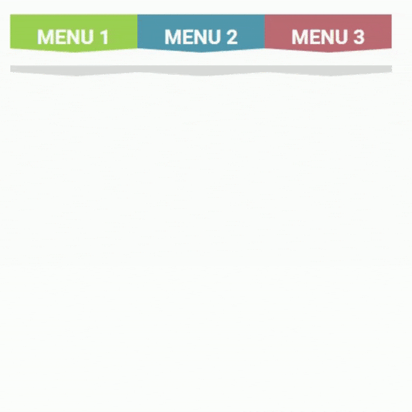
We’ll create a horizontal list of three menu items (Menu 1, Menu 2, Menu 3). Each of these will include a nested list that appears on hover, containing links such as Home, About, Service, and Contact.
💻 HTML Code
Once the HTML structure is in place, save the file with a .html extension (for example, index.html). Next, we’ll move on to styling it with CSS.
🎨 Step 2: Add CSS Styling for Drop-Down Menu
Now that our menu is structured, it’s time to make it visually appealing and interactive using CSS.
We’ll use hover effects, transitions, and pseudo-elements to create smooth animations and a professional look.
Key Concepts:
:hoverselector: Displays the dropdown items when the user hovers over the menu.- Transitions: Add smooth opening and closing animations.
- Positioning: Keeps submenus aligned correctly under their parent items.
💻 CSS Code
✅ Final Result of Drop-Down Menu
Once you’ve saved both the HTML and CSS files, open the .html file in your browser.
You’ll see a smooth, animated drop-down menu that’s fully responsive and created using only HTML and CSS — no JavaScript needed!
🏁 Conclusion
And that’s it! You’ve successfully built a simple and responsive drop-down menu using pure HTML and CSS. By combining semantic HTML with clever use of CSS hover effects and transitions, you can design clean, user-friendly navigation menus for any website.
This approach avoids JavaScript entirely, keeping your code lightweight and efficient while maintaining smooth interactivity.
If you’d like to extend this further, you can:
-
Add icons to your menu items.
-
Make it mobile-friendly with media queries.
-
Customize colors and animations to fit your site’s theme.