Creating visually engaging text effects can instantly elevate your website’s look and feel. One of the most popular modern styles is the glitch text effect, known for its distorted, digital-glitch aesthetic. This effect is perfect for loading screens, hero sections, or futuristic UI designs. In this tutorial, you’ll learn how to build a dynamic glitch effect using HTML, CSS, and JavaScript—no frameworks required.
Follow the steps below and you’ll have a fully animated glitch text effect running on your site in minutes.
Project Introduction
A glitch effect adds controlled distortion to text, producing an eye-catching digital interference look. It’s widely used in tech-themed websites, sci-fi interfaces, and modern animation styles.
In this guide, you’ll learn how to create a looping glitch animation using simple markup and JavaScript logic. By combining jQuery and Lettering.js, we animate each character independently, creating an impressive distortion sequence.
To get the files easily, you can join my Telegram channel for downloads and project resources.
Prerequisites
Before you begin, ensure you understand basic HTML, CSS, and JavaScript. You’ll also need a code editor such as VS Code or Sublime Text.
Once you’re ready, follow the steps below.
Source Code
Step 1: HTML Code
Start by creating your project folder and adding an index.html file. This file holds the text we’ll animate and links to all required libraries.
The structure includes:
- A
.worddiv containing the animated text. - An
.overlaydiv for subtle distortion. - External scripts: jQuery, Lettering.js, and our custom
script.js.
Paste the following HTML into your file:
<!DOCTYPE html>
<html lang="en">
<head>
    <meta charset="UTF-8">
    <meta http-equiv="X-UA-Compatible" content="IE=edge">
    <meta name="viewport" content="width=device-width, initial-scale=1.0">

    <title>Dynamic Glitch Text Effect</title>

     <link rel="stylesheet" type="text/css" href="styles.css">
</head>
<body>
    <div class="word">Loading...</div>
    <div class="overlay"></div>
    <script type="text/javascript" src="https://cdnjs.cloudflare.com/ajax/libs/jquery/2.1.3/jquery.min.js"></script>
    <script type="text/javascript" src="https://cdnjs.cloudflare.com/ajax/libs/lettering.js/0.6.1/jquery.lettering.min.js"></script>
    <script type="text/javascript" src="script.js"></script>
</body>
</html>
Once your structure is ready, move on to styling.
Step 2: CSS Code
The CSS below styles the background, positions the text, and prepares the glitch animation transitions. It handles shadows, distortions, and the motion behavior of each character.
Create a file named styles.css and paste:
@import url(https://fonts.googleapis.com/css?family=Source+Code+Pro:400);

html,
body {
  height: 100%;
}

body {
  background: radial-gradient(#222922, #000500);
  font-family: 'Source Code Pro', monospace;
  font-weight: 400;
  overflow: hidden;
  padding: 30px 0 0 30px;
  text-align: center;
}

.word {
  bottom: 0;
  color: #fff;
  font-size: 2.5em;
  height: 2.5em;
  left: 0;
  line-height: 2.5em;
  margin: auto;
  right: 0;
  position: absolute;
  text-shadow: 0 0 10px rgba(50, 150, 50, 0.5), 0 0 5px rgba(100, 255, 100, 0.5);
  top: 0
}

.word span {
  display: inline-block;
  transform: translateX(100%) scale(0.9);
  transition: transform 500ms;
}

.word .done {
  color: #6f6;
  transform: translateX(0) scale(1);
}

.overlay {
  background-image: linear-gradient(transparent 0%, rgba(10, 16, 10, 0.5) 50%);
  background-size: 1000px 2px;
  bottom: 0;
  content: '';
  left: 0;
  position: absolute;
  right: 0;
  top: 0;
}
Your text is now fully styled. Next, let’s animate it using JavaScript.
Step 3: JavaScript Code
Create a file named script.js and paste the following code exactly:
function Ticker( elem ) {
	elem.lettering();
	this.done = false;
	this.cycleCount = 5;
	this.cycleCurrent = 0;
	this.chars = 'ABCDEFGHIJKLMNOPQRSTUVWXYZ1234567890!@#$%^&*()-_=+{}|[]\\;\':"<>?,./`~'.split('');
	this.charsCount = this.chars.length;
	this.letters = elem.find( 'span' );
	this.letterCount = this.letters.length;
	this.letterCurrent = 0;

	this.letters.each( function() {
		var $this = $( this );
		$this.attr( 'data-orig', $this.text() );
		$this.text( '-' );
	});
}

Ticker.prototype.getChar = function() {
	return this.chars[ Math.floor( Math.random() * this.charsCount ) ];
};

Ticker.prototype.reset = function() {
	this.done = false;
	this.cycleCurrent = 0;
	this.letterCurrent = 0;
	this.letters.each( function() {
		var $this = $( this );
		$this.text( $this.attr( 'data-orig' ) );
		$this.removeClass( 'done' );
	});
	this.loop();
};

Ticker.prototype.loop = function() {
	var self = this;

	this.letters.each( function( index, elem ) {
		var $elem = $( elem );
		if( index >= self.letterCurrent ) {
			if( $elem.text() !== ' ' ) {
				$elem.text( self.getChar() );
				$elem.css( 'opacity', Math.random() );
			}
		}
	});

	if( this.cycleCurrent < this.cycleCount ) {
		this.cycleCurrent++;
	} else if( this.letterCurrent < this.letterCount ) {
		var currLetter = this.letters.eq( this.letterCurrent );
		this.cycleCurrent = 0;
		currLetter.text( currLetter.attr( 'data-orig' ) ).css( 'opacity', 1 ).addClass( 'done' );
		this.letterCurrent++;
	} else {
		this.done = true;
	}

	if( !this.done ) {
		requestAnimationFrame( function() {
			self.loop();
		});
	} else {
		setTimeout( function() {
			self.reset();
		}, 1000 );
	}
};

$words = $( '.word' );

$words.each( function() {
	var $this = $( this ),
		ticker = new Ticker( $this ).reset();
	$this.data( 'ticker', ticker  );
});
This script automatically scrambles and reveals each character, creating the signature glitch animation.
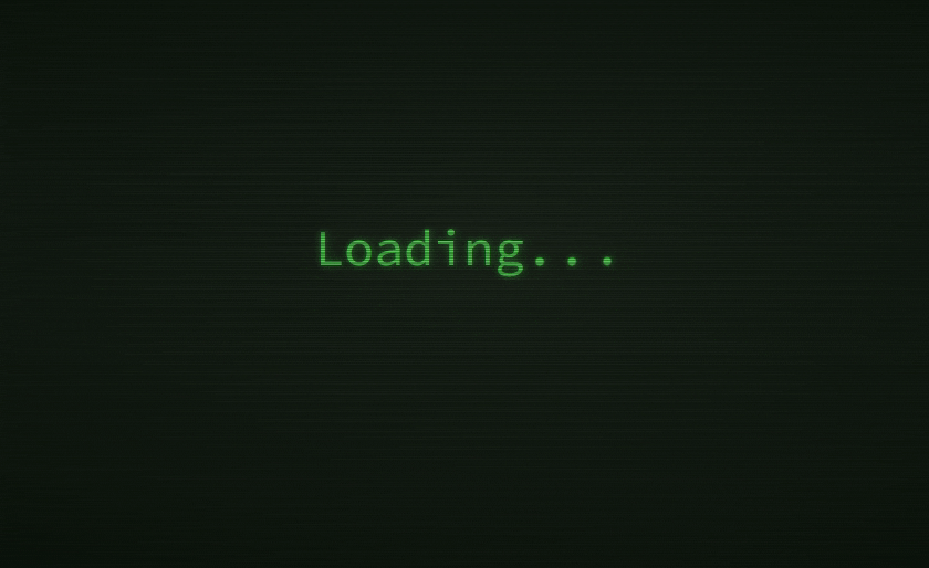
Final Output
Conclusion
You’ve successfully created a fully functional glitch text effect using only HTML, CSS, and JavaScript. This effect adds a modern, edgy aesthetic to any project—perfect for tech interfaces, loading indicators, and stylish landing pages.
Feel free to customize:
- colors
- speed
- fonts
- characters
- background effects
Experiment to craft your own unique glitch animations.
If you found this tutorial helpful, be sure to explore more creative UI animations and join the Telegram channel for downloadable project files.