Charts are a powerful tool that can be used to visualize data in a way that is easy to understand and interpret. Excel offers a wide variety of chart types, each of which is suited for a different type of data.
Introduction
Some of the most common chart types in Excel include:
- Column charts: Column charts are used to compare values across different categories. They are a good choice for data that is categorical in nature, such as sales by product or region.
- Line charts: Line charts are used to track changes in values over time. They are a good choice for data that is sequential in nature, such as sales over the past year.
- Pie charts: Pie charts are used to show the proportion of a whole that is made up of different parts. They are a good choice for data that is categorical in nature and where the parts add up to 100%.
- Bar charts: Bar charts are similar to column charts, but they are typically used to show data that is ordinal in nature, such as customer satisfaction ratings.
- Area charts: Area charts are similar to line charts, but they fill the area under the line with a solid color. They are a good choice for data that you want to emphasize the changes in values over time.
In addition to these common chart types, Excel also offers a variety of other chart types, such as scatter chart, radar chart, and bubble chart. The best chart type to use for a particular set of data will depend on the type of data, the purpose of the chart, and the audience who will be viewing the chart.
Create a Chart
To create a line chart, execute the following steps.
1. Select the range A1:D7.

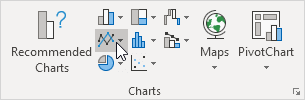
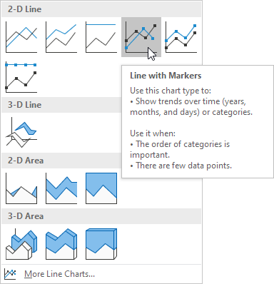
2. On the Insert tab, in the Charts group, click the Line symbol.
3. Click Line with Markers.
Result:
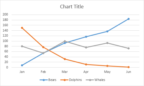
Note: enter a title by clicking on Chart Title. For example, Wildlife Population.
Change Charts Type
You can easily change to a different type of chart at any time.
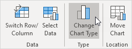
1. Select the chart.
2. On the Design tab, in the Type group, click Change Chart Type.
3. On the left side, click Column.
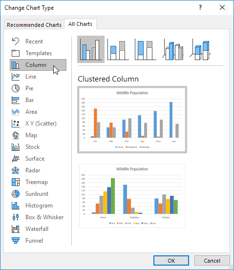
4. Click OK.
Result:

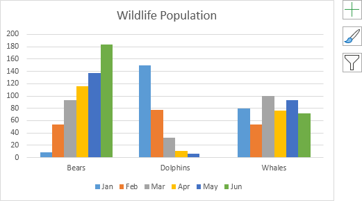
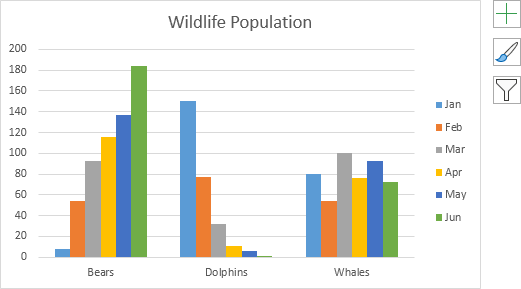
Switch Row/Column in Charts
If you want to display the animals (instead of the months) on the horizontal axis, execute the following steps.
1. Select the chart.
2. On the Design tab, in the Data group, click Switch Row/Column.
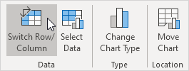
Result:
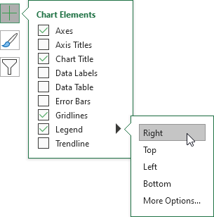
Legend Position
To move the legend to the right side of the chart, execute the following steps.
1. Select the chart.
2. Click the + button on the right side of the chart, click the arrow next to Legend and click Right.
Result:
Data Labels
You can use data labels to focus your readers’ attention on a single data series or data point.
1. Select the chart.
2. Click a green bar to select the Jun data series.
3. Hold down and use your arrow keys to select the population of Dolphins in June (tiny green bar).
4. Click the + button on the right side of the chart and click the check box next to Data Labels.

Result:

Charts can be a valuable tool for data analysis. They can help you to visualize data, identify trends, and communicate your findings to others. If you are working with data in Excel, be sure to take advantage of the charting capabilities of the program.
Here are some additional tips for creating effective charts in Excel:
- Use the right chart type for your data.
- Keep your chart simple and easy to understand.
- Use clear and concise labels.
- Use consistent formatting throughout your chart.
- Add a title to your chart that summarizes the key findings.
- Use a legend to identify the different data series in your chart.
- Consider adding data labels to your chart to show the exact values of the data points.
- Format your charts to match the overall style of your document.
By following these tips, you can create chart that are both informative and visually appealing.
| Next Chapter: Pivot Tables |